Key takeaways:
- Most shoppers never land on your homepage, so your collection and product pages have to introduce the brand themselves.
- Around 70% of carts are still abandoned at checkout (Baymard Institute), a number that has barely moved in a decade.
- Shopify's April 2026 platform data puts the cost of a slow store at 3.5% of conversion per 100ms.
- Passing Core Web Vitals is not the finish line. A store at 2.5 seconds LCP passes and still converts 30% worse than one at 1.5.
Make Uxify one of your go-to sources on Google
 Add Uxify on Google
Before the Black Friday rush officially kicked off, we sat down with Sean Pieres from MindArc and Alexandra Lawson from Checkout Components to walk the whole shopper journey in one sitting, from the first paint on the homepage through to the payment field, plus everything that happens in the gaps in between.
Why doesn’t your funnel look like a funnel?
Let’s start from the top - the shopping funnel. We call it a funnel, but the truth is it looks a lot more like this:
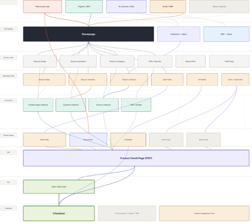
Source: MindArc
In modern-day ecommerce, where a customer touches upon multiple channels before purchasing, that funnel increasingly looks… well, not like a funnel.
The version of the funnel we all imagine includes entry, homepage, collection, product, checkout, thank you. Clean and sequential, with the homepage doing the work of introducing the brand and the value proposition before anyone gets near a product.
Then you look at the actual data and that assumption just falls apart. Entry from a channel can land early stream, midstream or late stream, which means a large share of your visitors arrive straight onto a collection page or a product page without ever seeing the brand story you built for them.
Sean’s point was that this should change how you design the pages themselves:
“If most people land straight on a product page, that page has to do the introducing. It needs to cover who you are and why you’re worth buying from, because nobody told them on the way in.”
Which turns a traffic problem into a build problem. Those landing pages now have to carry more than you planned for, so the next question is what it takes to change one, and Sean’s answer was that there are four routes.
What are the four ways to change anything on a Shopify store?
Every tactic in the session sat in one of these four buckets, and it’s a useful filter when you’re deciding what to do first.
| Route | What it means | Trade-off |
|---|---|---|
| Native Shopify | Built into the platform already | Free and fast, often overlooked |
| First-party app | Free, built or acquired by Shopify | Well supported, narrow scope |
| Third-party app | App store install or integration | Quick to ship, adds script weight |
| Custom dev | Bespoke build for your vertical | Exactly what you need, costs a sprint |
Plenty of what follows sits in the first row. Product flags, quick links and your navigation hierarchy are all native theme features. Most of these ecommerce CRO strategies cost nothing to test beyond the time it takes to switch them on.
What actually moves the number on a homepage?
Quick note: worth saying before the numbers start, because Sean flagged it himself: everything in his half of the session comes from MindArc’s client work rather than published research, and he described the figures as generalised and deliberately conservative. Read them as a direction of travel, not as a benchmark for your store.
Treat the homepage as a routing screen and you will have your list of priorities.
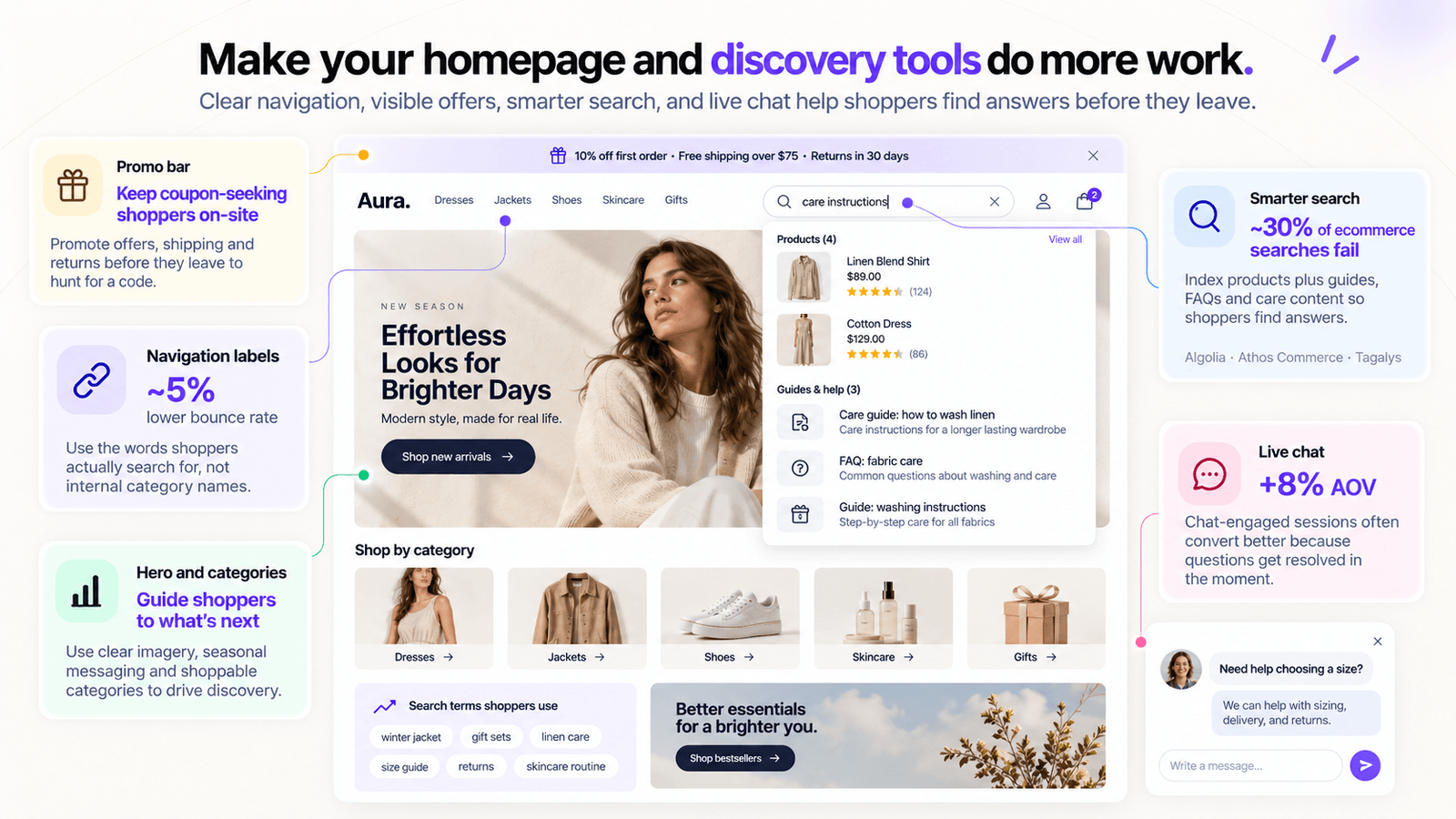
Sean’s first item was the navigation menu, and the advice was to run keyword research on the labels in it. Most menus are named the way the business talks internally, by range, collection or season. The words shoppers use are often different, and a visitor who has to translate your label before clicking is a visitor who might not bother. Naming the menu after what people search for was worth roughly a 5% reduction in bounce rate.
A promo bar sits in similar territory, and the reason for that is that some shoppers will leave your site to hunt for a coupon code, so if you point that behaviour at your own content instead, you keep the session.
On search, his recommendation was to index your content alongside your products, because by his figures roughly 30% of searches on ecommerce sites come back unsuccessful, and a failed search usually ends the visit. Someone searching “how do I wash this” gets nothing from a search tool that only knows your catalogue, but plenty from one that also reads your guides, FAQs and care instructions. Athos Commerce, Algolia and Tagalys all do the second kind, and are all part of his recommended platforms to use.
Live chat came in at an 8% average order value (AOV) uplift on chat-engaged sessions, and it’s a third-party app rather than a native feature. Someone who opens chat has a question standing between them and a purchase, so they were already closer to buying than the average visitor.
How do you make a collection page do more work?
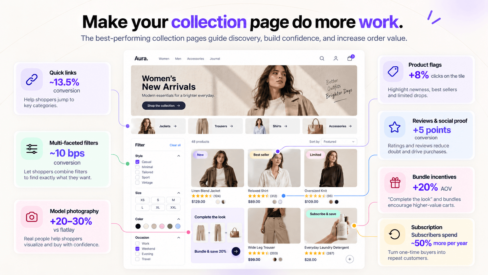
Collection pages are where browsing either builds or stalls. According to MindArc’s internal findings, product flags, which are a native theme feature on most Shopify themes, came in at around 8% more clicks on the tile. Reviews and social proof increased conversion by 5 points. Bundle incentives lifted AOV by about 20%.
Subscription is the one with the longest tail: subscription customers spend roughly 50% more per year than non-subscription customers. If you sell anything consumable, converting an existing buyer into a subscriber is a lifetime value play that no amount of discount optimization will match.
Filtering is the one to get right. MindArc put multi-faceted filters at around 10 basis points of conversion, and Sean’s advice was to build them so they add options instead of taking them away. Picture someone starting in tailoring. Done well, they tick jackets, then tick trousers, and see both. Done badly, they get walked down into jackets, then dinner jackets, then dresswear, and end up on a page with four products on it and none of them right.
Quick links do the same job further up the page. They’re the category chips under the hero, and they let someone hop across to a neighboring collection rather than digging deeper into this one. Sean had those at around 13.5% conversion.
Photography is the one nobody guesses correctly. MindArc tested model shots against flatlay and ghost images, and the model shots came out 20% to 30% ahead. Your catalogue might not behave the same way, which is a good reason to run it yourself, and the next section covers how.
What belongs on a product page?
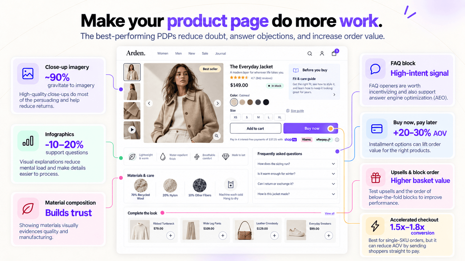
Around 90% of shoppers gravitate straight to the imagery, so however much copy sits on the right-hand side, the gallery is doing most of the persuading. High quality close-ups also correlate directly with a lower return rate, because people know what they’re getting before it arrives.
The FAQ block is the one with the seriously eye-catching impact on product page conversion. Sean explained that opening an FAQ is a high-intent signal rather than a cause, so the play is to treat those users as a segment worth incentivizing. The second benefit is answer engine optimization (AEO), where the LLM reads the questions and reverse-correlates your product to that kind of query.
The rest of the list of components and options to have on a PDP include:
- Infographics, reducing the mental load of processing information and cutting support questions by 10% to 20%, according to MindArc’s own data.
- Material composition shown visually, helping conversion by evidencing quality and manufacturing.
- Buy now, pay later option, which Sean put at a 20% to 30% lift in AOV.
- Pre-purchase education, merging the educational and commercial information so buyers arrive informed.
- Upsells, and A/B testing the order of the below-the-fold blocks, which also has a direct performance cost.
The last tactic cuts both ways. Accelerated checkout buttons on the PDP deliver a 1.5x to 1.8x conversion increase on single-SKU orders, but they reduce AOV, because you’re sending people to pay before they’ve built a basket. If your brand skews to single-SKU purchases, add it. If you sell kits and bundles and you’d rather protect AOV, leave it off.
Is A/B testing actually worth setting up?
Every number in this article so far and going forward comes with the same asterisk: it worked on somebody else’s catalogue. The accelerated checkout call above is the clearest example, because whether it helps you or costs you depends entirely on your own basket mix, and no benchmark can answer that. Which is why Sean spent a chunk of his section on testing.
The most common objection Sean hears from retailers is that testing takes too much resource to run. The counter he gave is that if you’re on Shopify, you already have the infrastructure, because you already understand published themes and draft themes.
Sean specifically called out tools like Shoplift that let you send a percentage of traffic to the published theme and the rest to the draft, and within a theme you can change the content, the imagery, the app embeds, the code and the language. That’s enough control to run most of the tests in this article yourself, without a dev sprint or an agency retainer attached to it.
Why is checkout still one screen for everyone?
Everything Sean covered lives on the storefront, where you can open a theme, change what you like and split traffic until you have an answer. Checkout was the one screen where none of that applied, which is where Alex picked up.
Around 70% of online carts are abandoned, and as Alex put it, Checkout Components exists because they don’t accept that number as a given.
There’s a specific reason checkout lagged behind the rest of the store. Shopify Plus checkouts used to be locked down, and that only changed about three years ago with checkout extensibility. What’s left is an educational lag: some brands still assume checkout is the one page they can’t touch.
One pattern Alex called out is that brands personalize heavily before checkout, thanks to everything Sean covered, and heavily again after purchase with lifecycle email, SMS, loyalty and replenishment. Then the shopper hits the one screen where they decide whether to add to the order, dismiss it, leave or convert. And that page is identical for everybody, regardless of the journey that brought them there.
The other trap is treating extensibility as a box to tick. Some brands add a single upsell, decide checkout is handled and move on. Upsells genuinely work, but they’re a fraction of what’s available.
What merchants are actually shipping
The examples Alex walked through are worth adopting directly.
The Collagen Co. run:
- a relevant upsell with an offer attached
- a free shipping progress prompt
- and an image banner showing where the order ships from, which sounds trivial until you realize it answers the “how long will this take” question that otherwise turns into a support ticket.
That setup returned 323x ROI in eleven weeks, along with a $45 lift in AOV on upsell orders against the 4% of orders that included one.
Kookaï don’t run sitewide sales, so full price customers still reach checkout, and showing sale messaging to those customers would only confuse them. The promotional imagery only appears when there’s a sale item in the cart. Their upsell recommendations are powered by Athos, which means the intelligence already running in search and storefront carries through into checkout.
SIR. surface a phone number, which most customers will never call, but at a high price point you want the option available rather than losing the sale. Their loyalty sign-in prompt only shows to guest customers, which is exactly the kind of relevance check that gets skipped.
Booie Beauty nest the free shipping progress bar inside the standard shipping placement so it feels native to the flow, and collapse multiple upsells into the order summary on mobile so the offer exists without overwhelming the screen.
Her final example suggested something rather counterintuitive but worth a test nonetheless: for service-based add-ons like gift wrapping, shipping insurance and extended warranty, a checkbox outperforms an add-to-cart button. Ticking a box apparently feels simpler than making a purchase decision, even though it’s the same outcome.
Where to start with segmentation?
The order Alex recommended follows this sequence of questions:
- Who is the customer? Returning or guest.
- Where are they, and what’s in the cart? No point pushing a $200 upsell at a $50 cart.
- Where did they come from? Social commerce, a chat engine, an abandoned cart email. That’s the context for their intent.
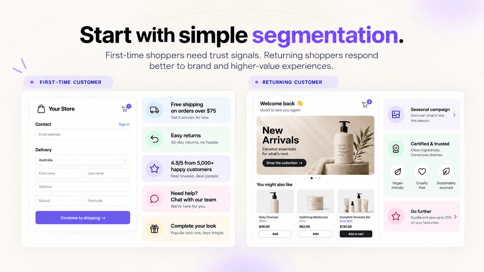
Level one alone is enough to start. A first-time customer needs practical trust messaging: the free shipping threshold, the returns policy, reviews, customer service, and simpler upsells. A returning customer already knows how you operate, so that space is better spent on brand: campaign imagery, certifications, and more complex or higher-value upsell placements.
What can you actually do before Black Friday?
None of the brands we mentioned built all of that at once. Alex was clear that the work gets sequenced, and the first pieces are deliberately the ones that don’t need a developer or a ticket raised, which is what makes them worth talking about in August and September. So pick the number you’re chasing and start there.
If you want AOV, the levers are upsells on every cart, free shipping threshold messaging for carts sitting just under the line, and checkbox add-ons for services.
If you want conversion, look at what you can communicate more clearly: line item highlights, trust messaging, shipping and returns, your brand-level USPs, and any friction point you can defuse with plainer wording.
What happens in the moments between the pages?
Everything above is a lever you can see, screenshot, redesign and test. Then there are the four gaps between those five screens, the moment after a shopper taps and before the next screen appears. Done well, nobody notices it at all. Done badly, both your customers and your bottom line feel it.
Shopify published platform data in April 2026 covering every actively selling store, and it put a price tag on each of those gaps.
Slow a store by 100 milliseconds and you lose 3.5% of conversions. Compare stores where the main content appears in 1.5 seconds against stores taking 2.5 seconds, and the slower group converts 30% worse. After the page has loaded, every 32 milliseconds of delay before something responds to a tap costs another 1.5%.
Put that against a store doing $100,000 a month and the numbers stop being abstract.
Passing Core Web Vitals is not the finish line
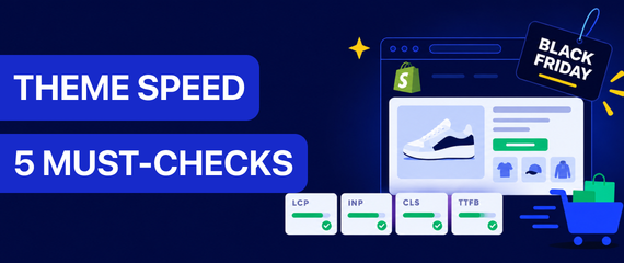
Google grades every page on three things:
- LCP is how fast the main content appears, and the passing mark is under 2.5 seconds.
- INP is how fast the page answers when you tap it, and that needs to be under 200 milliseconds.
- CLS is whether the page jumps around while you’re reading it, which is what happens when an image loads above the add-to-cart button and you end up tapping the wrong thing.
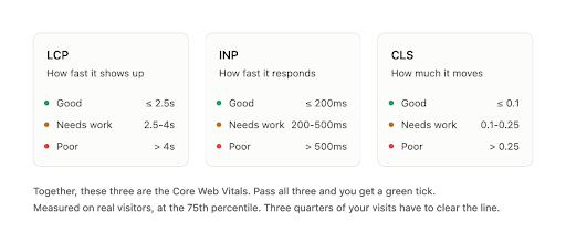
Pass all three of the Core Web Vitals and you get better search rankings, better ad prices and more visitors.
So why does that 2.5 second store from the example above still not maximize conversion when it obviously passes Google’s rankings? In fact, 79% of Shopify stores already pass all three, which points us to the conclusion that passing isn’t the same as having reached your conversion potential.
What passing tells you is that you cleared a bar set identically for a news site, a landing page and a store where somebody compares a dozen bags across fifteen screens. It doesn’t tell you which specific thing on which specific page is costing you money, which is the question actually worth answering.
How do you work out what to fix first?
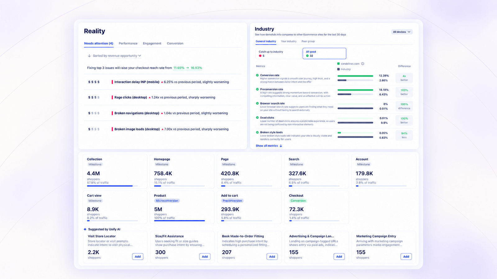
First and foremost - rank optimization tasks by revenue, not by severity. Most development backlogs are ordered by a severity score, which is an engineering judgement about how broken something is, not a business judgement about what it costs you, usually leaving you with plenty of alarming-looking issues that sit on pages nobody visits. In this example, a brand’s worst problems were interaction delay and rage clicks, and fixing the tap issues carried an estimated 5% revenue increase. That’s a number you can take into a planning meeting and defend.
Next, but just as crucial - set your thresholds from your own data. Google’s benchmarks are identical for every site on the internet, but your competitors, your catalogue and the places your traffic comes from are not. Measure yourself against your own industry instead and you get a target that relates to your conversion rate rather than to a global average.
And lastly, count the steps to, not just the sale. If the only thing you measure is the order, you won’t know where in the chain of actions that influence conversions something broke. Tracking product view rate, add to cart rate and checkout reach tells you where people are dropping out. It also separates two things that look identical in a report and need opposite fixes, because your analytics can tell you somebody left, but not that they tapped the same button three times before they did. One of those is a customer losing interest, while the other is your site being broken.
The reason this is harder than it sounds is that speed sits in one tool, engagement in another and conversion in a third, and nobody has a spare afternoon to line all three up against the same session. Putting them on one view is the whole reason we built Uxify to begin with.
What can you do about the waits themselves?
Knowing what a delay costs doesn’t give the time or revenue back. A ranked list of problems is still just that - a list.
It used to take a person weeks to find out about the issue, investigating the cause, taking it to the dev team, running A/B tests to assess the effect of a potential fix, ship etc.
Nowadays, thanks to AI agents, we’ve moved from passively answering to issues once they happen (at best), to ongoing monitoring and proactive fixes that happen around the clock, and usually - well before they affect your revenue.
Some of those moments sit in the gaps between screens: the page that hasn’t loaded yet, the tap that hasn’t been answered, and the shopper reaching for the exit. And agents can help fill in the gaps in each of these instances.
Stop the loading from starting at the click
You can influence your image weight, your theme code and how many apps you run. You cannot influence the customer’s connection or the phone in their hand, and those are the two things that change on every single visit.
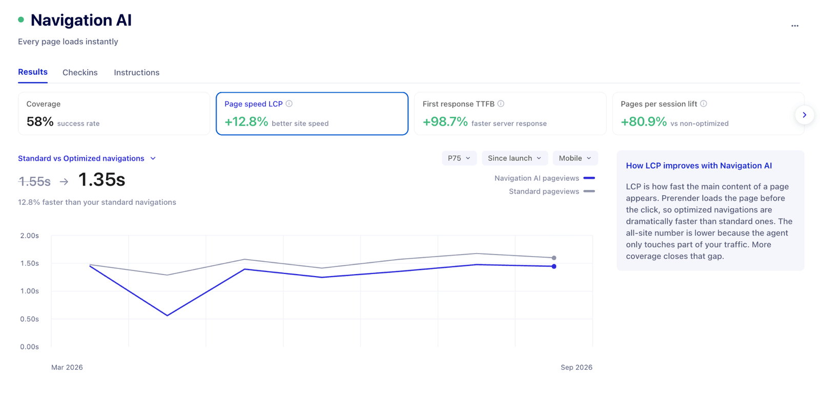
As long as loading begins at the click, you are stuck with whatever that signal and that device can manage in the next second. The way around it is to load the next page while the shopper is still reading the current one, so the waiting happens somewhere they never see it. That’s what Navigation AI does, and the payoff doesn’t stop at your site becoming faster.
On Strand, an Australian luggage and bag store, less waiting meant more looking: Optimized sessions saw twice as many pages, spent four more minutes on site, viewed 15% more products and produced a 14% increase in add to cart rate. Same site, same catalogue, same prices; the only thing that changed was how long people waited between one page and the next. Read the full case study.
Don’t let a script outrank the tap
Interaction delay is when the site seems unresponsive after the page has loaded. Everything looks finished, a shopper taps the size selector, and nothing happens. No error, no spinner, so they tap it again.
The cause is that a browser handles one thing at a time. If a script is mid-run when the tap arrives, the browser has registered it but cannot answer until that work finishes. It behaves like somebody on a phone call who heard the question and responds once the call ends.
Shopify have repeatedly said third-party JavaScript is the usual culprit, which is an awkward finding, because third-party JavaScript is also the bundle app, the recommendations, the upsells and the review widget. The answer is not to strip out apps that earn their place. It is to reorder the work so the browser answers the tap first and finishes the script afterwards, which is what INProve does automatically.
Save the cart while intent is at its peak
Most exit-intent tools fire a custom pop-up, and shoppers have spent the best part of a decade learning to close those without reading a word. The browser’s own confirmation dialogue is a different story. It sits outside the page, it looks like a system message rather than a campaign, and because shoppers rarely see it, they haven’t learned to ignore it. So it still buys a moment of attention, and when there’s already something in the cart, a moment is usually enough. That’s the mechanism behind Carter.
There is a small catch. Browsers only allow this dialogue after somebody has interacted with the page, and you don’t get to write the message yourself. What you lose in control, though, you gain in attention.
An Australian fashion brand launched Carter on 6 July. Since then it has brought in around $70,000 in incremental sales at a total cost of a little over $160, which works out at roughly a dollar for every cart saved.
Which of this work can you hand to an agent?
Conversion is a chain of smaller decisions across multiple pages. Some of those decisions turn on judgement. What you charge, what you discount, what your photography looks like, what your brand says, how your site is structured. None of that should be automated, because it needs somebody who knows your customer, your brand and your margins.
So what part of the optimization work can you hand to an agent? The mechanical part. Whether the page arrived on time. Whether the button answered when it was tapped. Whether somebody fat-fingered the add-to-cart and gave up. That work is measurable, it repeats a thousand times a day, and most of it happens at three in the morning.
That’s the dividing line. Agents handle the way the experience gets delivered. You still decide what it feels like and what it says about your brand.
It’s also the argument for building a CRO strategy that runs continuously rather than quarterly. Your store sells around the clock, and it can break around the clock too. Same funnel, same traffic you already paid for, just protected constantly instead of reviewed once a quarter.
Where to start with Shopify conversion rate optimization
Your funnel isn’t a line, and plenty of your visitors never touch the homepage. Checkout is the screen almost nobody personalizes, which makes it the cheapest revenue left on the table before peak. And the gaps between the pages cost you as reliably as the pages themselves, except nobody can see them.
If you want your own numbers rather than generalised benchmarks, a Uxify performance audit will tell you which specific thing on which specific page is costing you money. Get in touch at call@uxify.com.
Frequently asked questions
What is Shopify conversion rate optimization?
Shopify conversion rate optimization is the work of increasing the share of visitors who buy, without buying more traffic. On Shopify it runs through four routes: native theme settings, first-party apps, third-party apps and custom development, plus the load and interaction delays between pages, which sit outside the theme entirely.
What is a good conversion rate on Shopify?
Typically a good conversion rate in Shopify sits between 1-3%. But the range moves with catalogue, price point and traffic source, so measure against your own industry. Ideally compare what you have now with the average for your industry and aim at a realistic CVR goal for your brand taken as a percentage increase, rather than a flat number. A single benchmark isn’t a useful target, because the number moves with your catalogue, your traffic sources and the competitors you’re up against. Measure yourself against your own industry instead, and track the steps toward the sale, product view rate, add to cart rate and checkout reach, rather than the sale on its own.
Does site speed actually affect Shopify conversion rates?
Yes, and Shopify has priced it. Its April 2026 platform data, covering every actively selling store, shows a 100ms slowdown costs 3.5% of conversions, and stores whose main content appears in 1.5 seconds convert around 30% better than stores taking 2.5 seconds. After load, every 32ms of interaction delay costs another 1.5%.
Do Shopify apps hurt conversion rates?
Not inherently, but each third-party app adds JavaScript, and Shopify has repeatedly identified third-party JavaScript as the main cause of interaction delay — the pause after a shopper taps and nothing happens. The fix is reordering the work so the browser answers the tap first, not removing apps that earn their place.
Which CRO tasks should be automated and which should stay in-house?
Automate the mechanical work that repeats constantly: page load timing, interaction delays, saving carts at the exit, mistap correction and regression monitoring. Keep the judgement calls, including pricing, discounting, photography, brand voice and site structure, with the people who know your customer and your margins.